Why Your Contact Page Deserves More Attention
Your Contact page is more than a form—it’s your brand’s digital handshake. It’s where visitors decide whether to reach out, ask questions, or start a collaboration. According to HubSpot, a well-designed Contact page improves customer satisfaction and increases conversions by making communication easy and intuitive.
Yet many sites treat it as an afterthought. Let’s change that.
1. A Warm, Clear Headline
Don’t just label it “Contact.” Use a headline that feels human and inviting. Examples:
- “Let’s connect”
- “Ready to start your project?”
- “Have questions? I’d love to help.”
Thrive Design emphasizes that tone sets the stage—make it feel like a conversation, not a transaction.
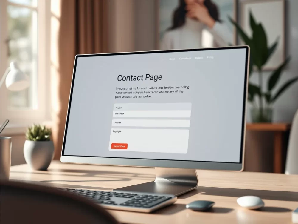
2. A Strategic Contact Form
Ask only what you need. A good form strikes a balance between simplicity and context. Include:
- Name
- Message box
- Optional: phone number, project type, budget range, timeline
If you receive frequent unqualified leads, consider adding a gentle filter, such as “What’s your budget range?” or “When are you hoping to start?” Thrive Design recommends this to reduce back-and-forth and improve lead quality.
3. Alternative Contact Options
Not everyone likes forms. Offer at least one backup:
- Direct email address
- Phone number (if applicable)
- Social media links (if you respond there)
This builds trust and accessibility. Paradox Marketing notes that multiple contact paths increase engagement and reduce friction.
4. Location or Service Area
Even if you work remotely, sharing your city or region can boost credibility and improve local SEO. Example:
“Based in Fairfax, VA—serving clients nationwide.”
This helps visitors feel like they’re contacting a real person, not a faceless entity.
5. Response Time or Office Hours
Set expectations. Let visitors know when they can expect to hear back. For example:
“I typically respond within 2–3 business days.”
“Available Monday–Friday, 9 AM to 5 PM EST.”
HubSpot recommends this to reduce frustration and build trust, especially during busy seasons.
6. Clear Purpose and Next Steps
Explain why someone should contact you and what happens next. For example:
“Use the form below to ask a question, request a collaboration, or share feedback. I read every message.”
This reassures visitors and encourages them to take action.
7. Spam Protection and Accessibility
Use CAPTCHA or honeypot fields to reduce spam. Ensure your form is mobile-friendly and accessible to screen readers. Thrive Design emphasizes that accessibility isn’t optional—it’s essential.
Final Thoughts
Your Contact page is where curiosity becomes connection. When it’s warm, straightforward, and easy to use, it invites meaningful outreach and builds trust. For Qwery M, that means emotionally intelligent messaging, strategic form design, and multiple ways to connect.
Ready to refine your Contact page? Explore Qwery M’s Content Strategy Hub for more tools to elevate your digital presence.
Last updated on November 15th, 2025 at 01:26 pm
Share this:

Discover more from Qwery M
Subscribe to get the latest posts sent to your email.

Melinda Osman is a content creator and strategist, and the founder of Qwery M. With a background in HR and digital publishing, Melinda empowers readers to thrive in their careers, lifestyles, and blogging. Discover practical tips, personal insights, and join a vibrant community. Learn more—click here.