A well-designed resume is more than a document—it’s your first impression. In 2025, resume design must balance clarity, professionalism, and keyword optimization to meet recruiter expectations and pass applicant tracking systems (ATS). With over 250+ applicants per job and AI filters scanning resumes in under 15 seconds, your layout must be strategic and scannable.
The Do’s of Resume Design
1. Keep It Clean and Simple
Use a minimalist layout with ample white space. Stick to fonts like Arial, Calibri, or Georgia in 10–12 pt size. Avoid decorative fonts that confuse ATS software.
2. Use Clear Headings and Sections
Structure your resume with standard headings:
- Professional Experience
- Education
- Skills
- Certifications or Achievements
Use bold or slightly larger fonts for section titles to guide the reader’s eye.
3. Prioritize Readability
Break content into bullet points and short phrases. Recruiters skim resumes—make it easy for them to find your qualifications fast.
4. Be Consistent
Maintain uniform formatting for fonts, spacing, and date styles. Inconsistent formatting can make your resume look sloppy and unprofessional.
5. Use White Space Strategically
Don’t cram content. Leave 1-inch margins and space between sections to improve visual flow and reduce cognitive load.
6. Incorporate Keywords Naturally
Use keywords from the job description to improve ATS compatibility. Tools like JobScan help identify relevant terms and optimize your resume for specific roles.
The Don’ts of Resume Design
1. Avoid Overly Creative or Unprofessional Designs
Skip flashy graphics, headshots, or unconventional layouts. These can confuse ATS systems or distract from your content.
2. Don’t Overload with Dense Text
Long paragraphs are hard to scan. Break information into digestible chunks using bullets and concise language.
3. Steer Clear of Inconsistent Formatting
Mixing fonts, sizes, or styles (bold, italic) without purpose creates visual clutter. Stick to a clean, unified look.
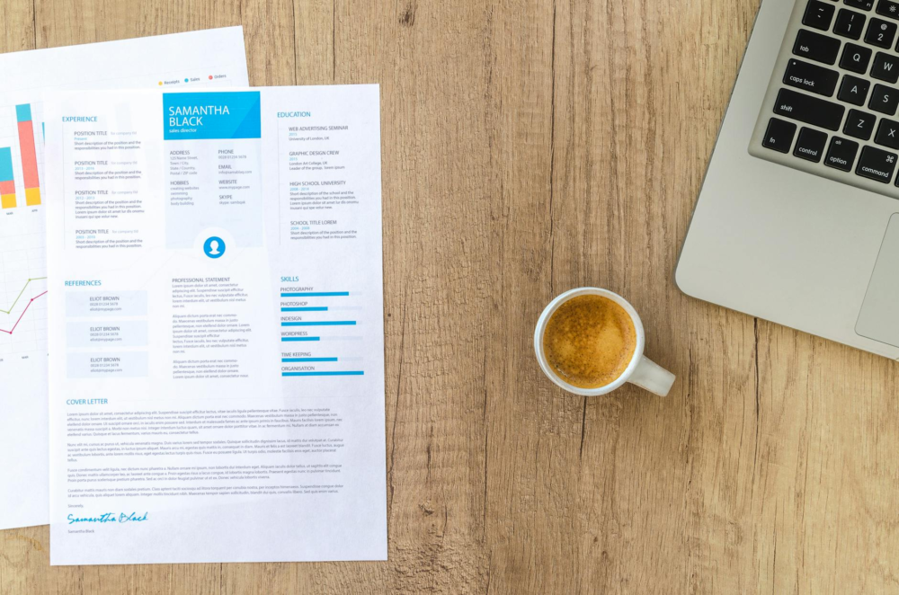
4. Avoid Outdated Templates
Templates from 2010 won’t cut it. Use modern, streamlined formats that reflect current design standards. Sites like Canva and NovoResume offer updated examples.
5. Don’t Forget Key Sections
Always include your contact information, LinkedIn profile, and relevant sections. Missing details can cost you the interview.
6. Refrain from Excessive Colors or Graphics
Use minimal accent colors (e.g., navy or charcoal). Bright colors or decorative elements can reduce professionalism and readability.
Final Tips for Resume Layout Success
- Test readability across devices and screen sizes
- Get feedback from mentors or peers
- Stay current with resume trends and hiring expectations
- Use reverse-chronological format unless applying for creative or functional roles
- Avoid tables and images that confuse ATS filters
Why Design Matters in 2025
Resume design isn’t just about aesthetics—it’s a strategic tool that helps you stand out. According to Resume Genius, 65% of hiring managers prioritize resumes that clearly showcase skills. A clean layout helps recruiters scan and improves your chances of landing interviews.
Ready to take your resume to the next level? Check out resume tips at Qwery M’s Resume and Cover Letter section for actionable advice and keyword strategies that help you stand out.
Last updated on February 13th, 2026 at 08:16 am
Share this:

Discover more from Qwery M
Subscribe to get the latest posts sent to your email.

Melinda Osman is a content creator and strategist, and the founder of Qwery M. With a background in HR and digital publishing, Melinda empowers readers to thrive in their careers, lifestyles, and blogging. Discover practical tips, personal insights, and join a vibrant community. Learn more—click here.